For over 20 years, Mairs Delicatessen had been a fixture of the Heworth Village community. Following a change in ownership, the challenge was to create a fresh identity that gave the established business a new direction while retaining its connection to the local community.
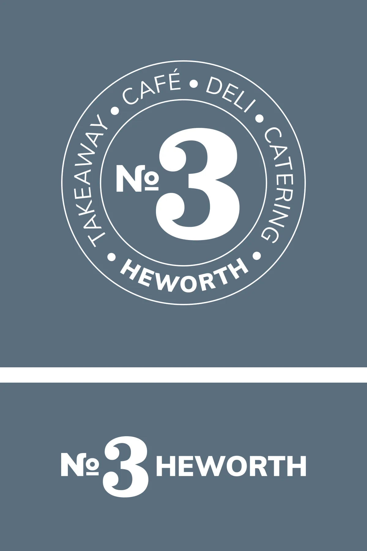
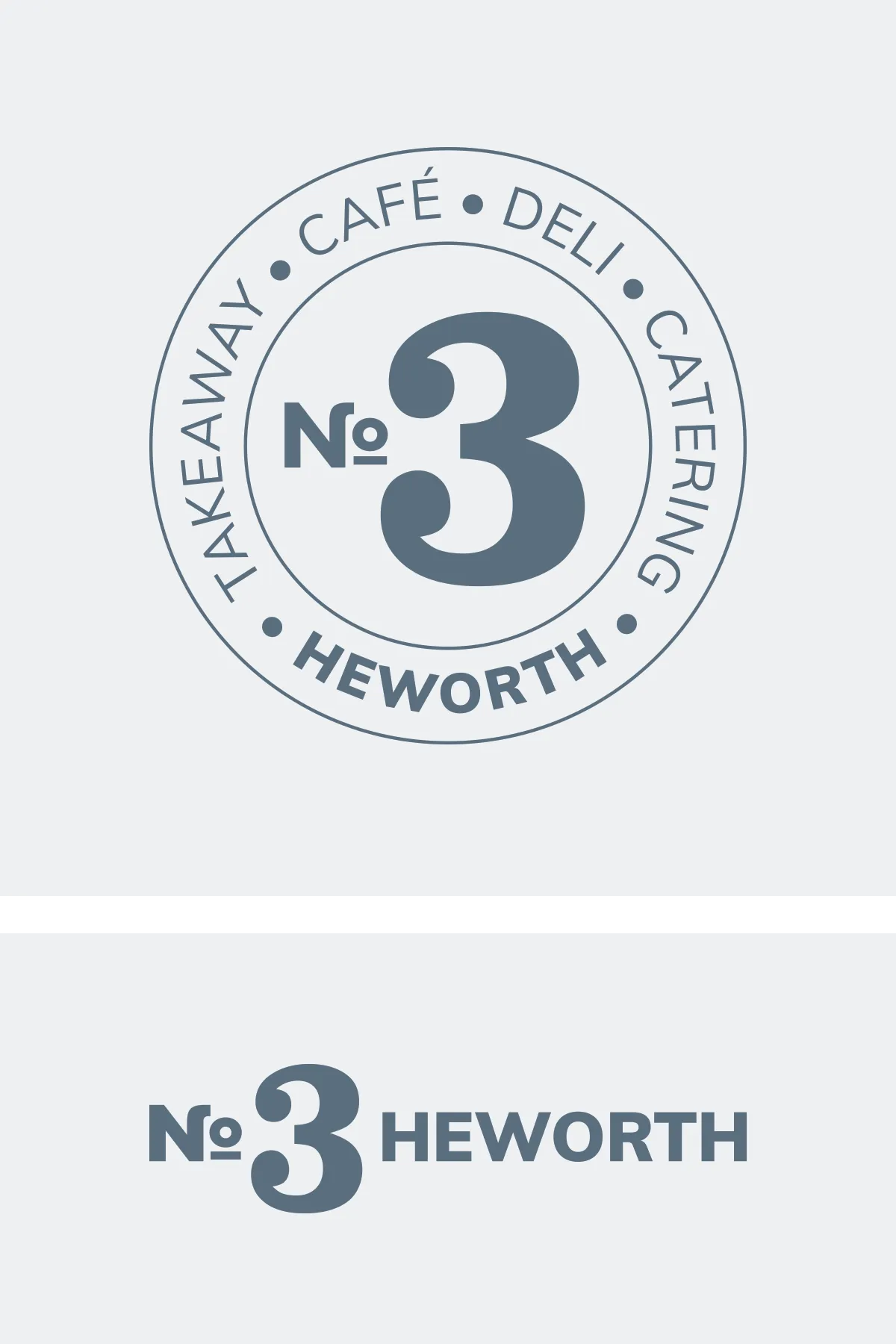
The new brand, No.3 Heworth, takes inspiration from its location at the heart of the village. We developed a flexible logo system combining a distinctive circular stamp with a clean, horizontal wordmark, allowing the identity to work seamlessly across signage, packaging, menus and digital applications.
A bold slab-serif numeral, paired with crisp geometric typography, balances character with contemporary simplicity. The slate blue/grey, black and white palette replaces the previous green storefront with a more refined, cohesive, and premium visual identity, creating a distinctive presence while complementing the warmth of the interior.
To provide the best experiences, we use technologies like cookies to store and/or access device information. Consenting to these technologies will allow us to process data such as browsing behaviour or unique IDs on this site. Not consenting or withdrawing consent, may adversely affect certain features and functions. View our Privacy Policy.